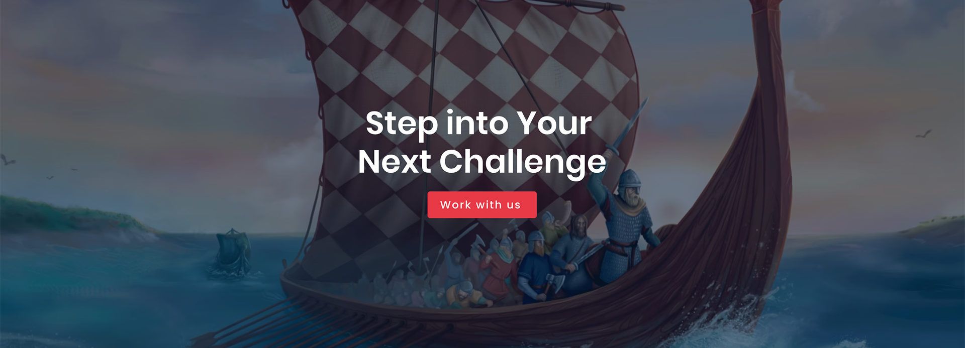
About the company
Gamucatex is a start-up game studio based in Copenhagen. Their flagship project, Tectonicus, combines storytelling and strategy to make learning about the past exciting and interactive.
My role:
I joined the start-up as the Art & Graphic Design Lead. I worked alongside game designers, developers, historians, archeologists and sound designers to develop the project. Tectonicus started in 2020 but was still in its early stages when I joined in Feb 2023.
My input:
Graphic design, visual communication, art direction (in-game art work), creative direction (overall brand), social media content planning and execution, team management.
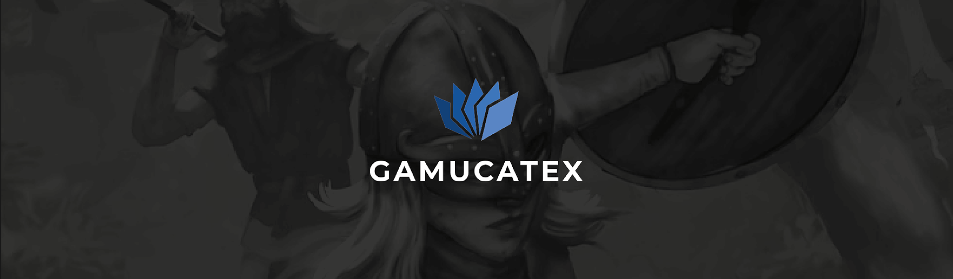
Visual identity:
While the logo mark and type already existed, I was given the task of creating a brand guide and branding assets using just the logo. The first step was to clean up the form and clearly define the colours.
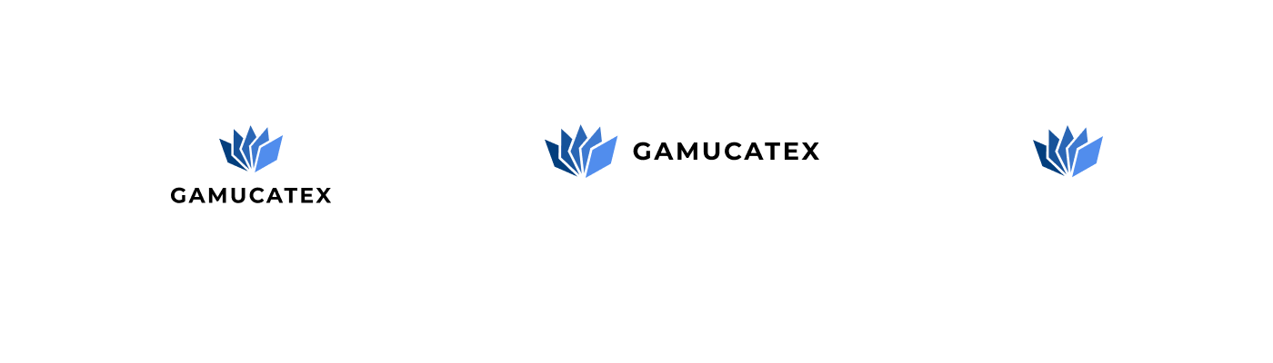
Logo and meaning:
The logo mark resembles a hand of cards since the game that is a current work in progress—Tectonicus, is a turn based card battler.The logotype can be used in 3 versions: full horizontal, full vertical and symbol only.
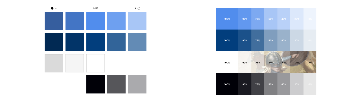
Primary colour palette:
Our primary colour palette consists of Chefchaouen Blue, Yale Blue, White and Cave Black. The primary colours are identifiers of Gamucatex. Chefchaouen Blue should be used as the predominant colour.

The brand guide defined tints, shades and levels of opacity that each of the colours from the primary palette can be used in. Colour application of this kind is used for social media posts, website and presentations.
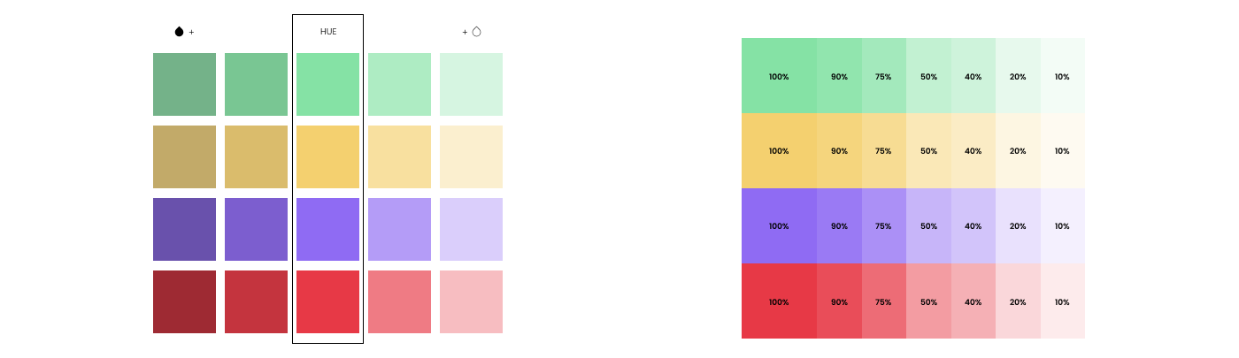
Secondary colour palette:
This palette is reserved for highlighting content and in-game UI assets. The colours consist of Celadon, Jasmine, Lavender, Red Apple. These colours are used extremely sparingly and do not represent the brand.

The secondary colours also have tints, shades and levels of opacity defined for each.
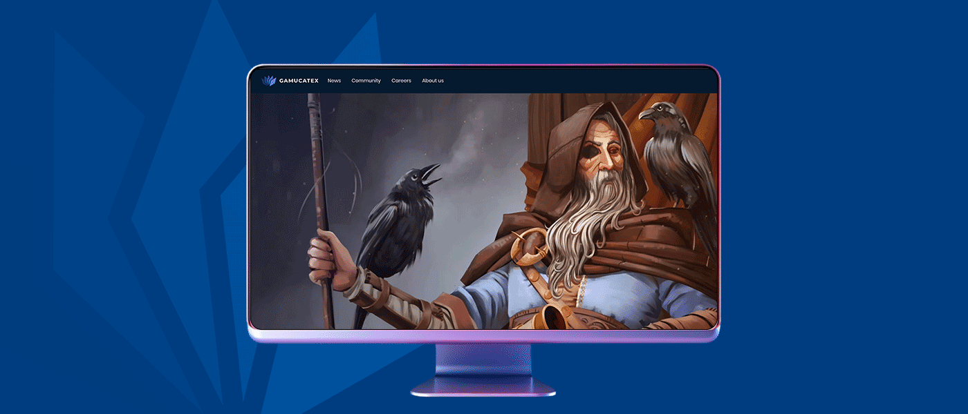
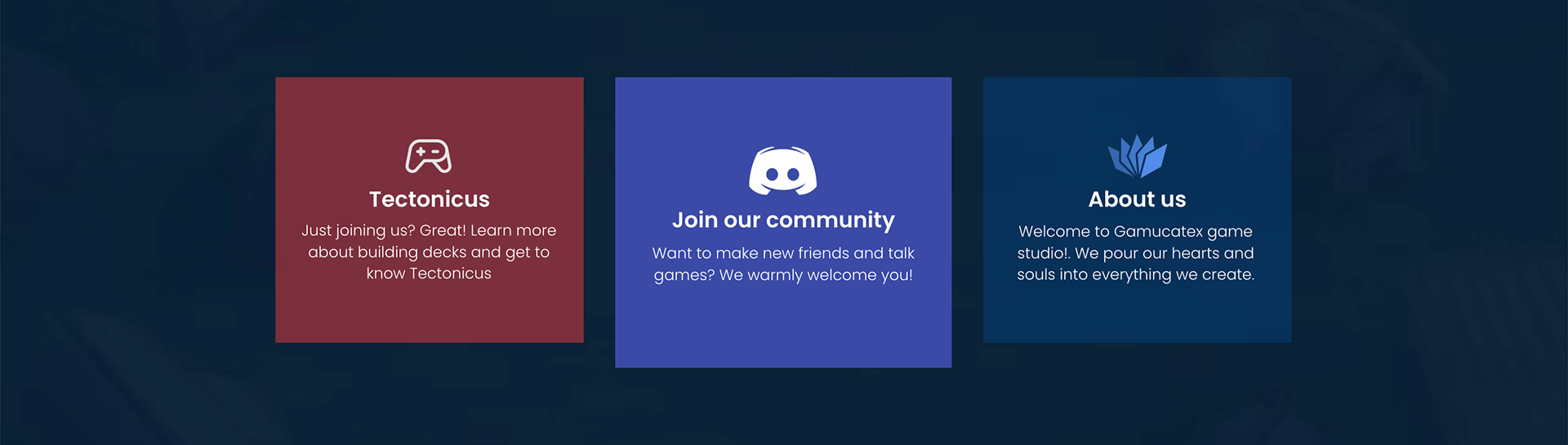
Some examples of how the colour combinations have been used on the website
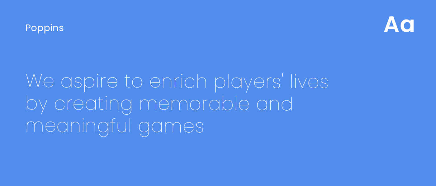
Primary font:
Poppins is the primary font for Gamucatex and comes in 18 styles. It is the default font used for body text and headings for internal and external communication.
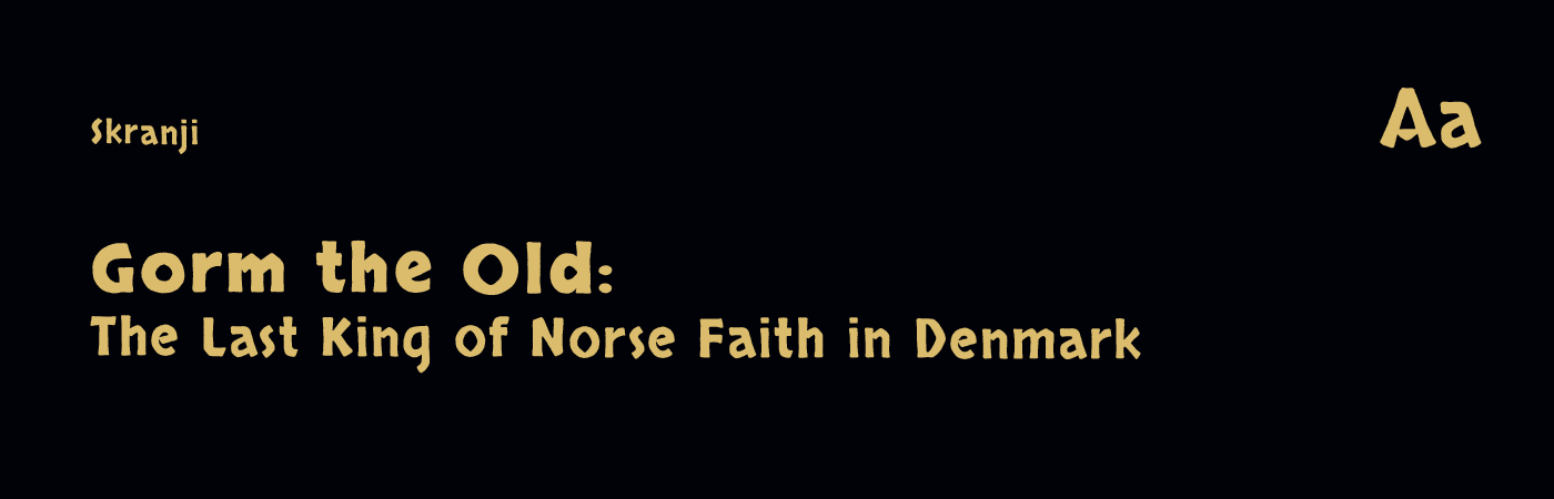
Highlight font:
Skranji was chosen as a stylised font for use in the game and for social media posts
Logo animation:
I was tasked with creative directing and project managing the logo animation. Together with the sound designer, animation artist and a graphic designer we presented four complete options for a logo animation.
Social media
I planned social media content along with the PR team, illustrators and historians. Weekly content was planned and created for the website blog, Facebook, Instagram, Tiktok and Discord.
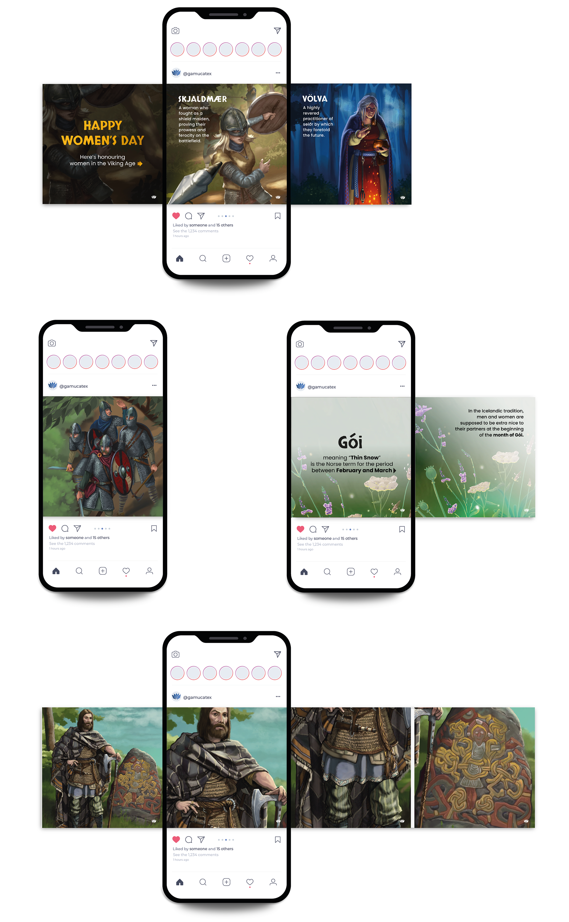
As part of my role, I managed and art directed the creation of illustrations and UI elements for the game Tectonicus: On the Edge of War.
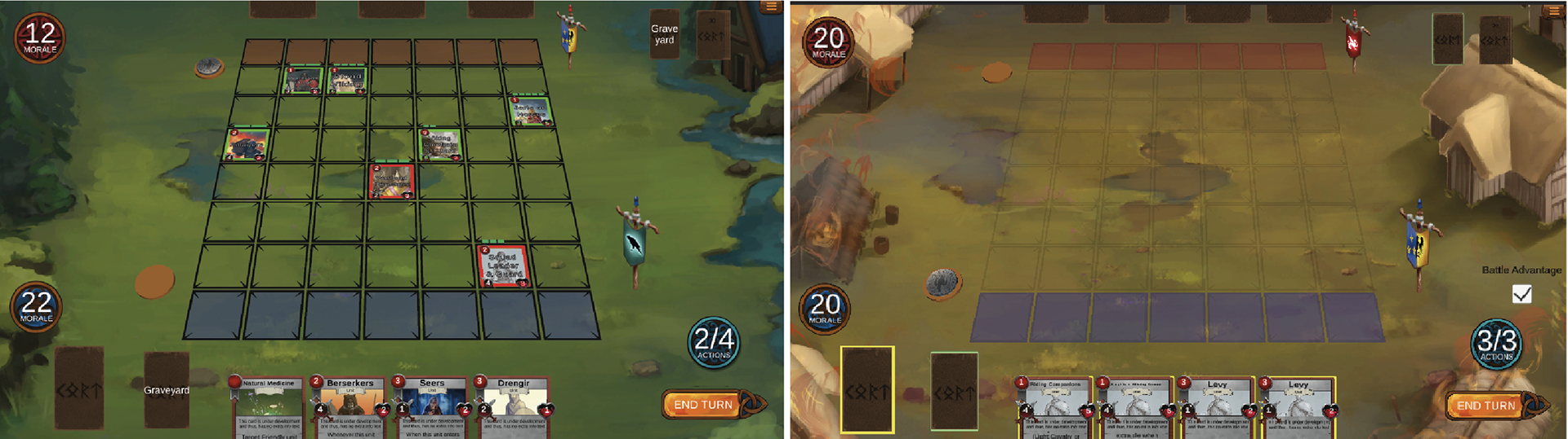
Battle boards
The battle board was initially on one background depicting a generic landscape.
My contribution: When I joined the team I picked up on a proposed idea of having unique backgrounds for each game—relating to a specific battle that took place in history (between the 3 chosen factions). Eg. The burning of Shouthwark—Anglo Saxons vs Franks/Normans which was the Norman Conquest of England.
IxD value added: Each gameplay now looked different through relevant visual content in the backgrounds.
Future scope: The background can pan or tilt to showcase more of the visual surroundings: important landmarks, army camps, battle band members that are not showcased in the static canvas. This can further increase the users interaction and experience while playing the game.
Left: Old Background; Right: One of the new backgrounds—The Burning of Southwark
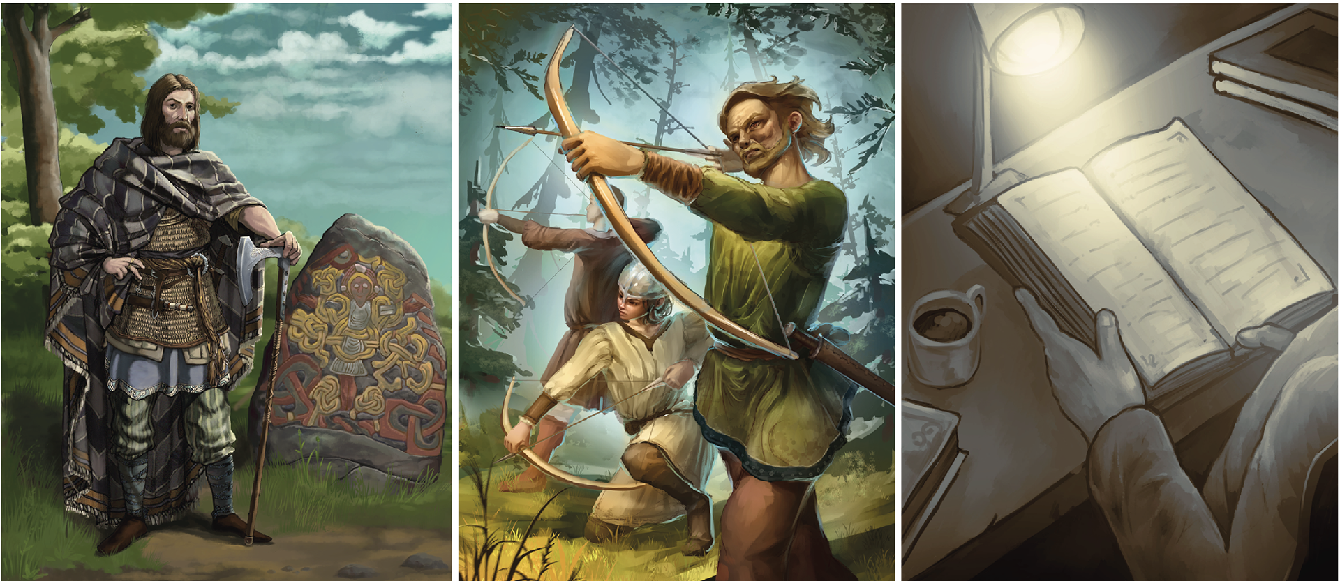
Cards
The cards used in the game are of 3 kinds: Unit cards—depicts more than one person and carries out an action, Hero card—depicts one historically significant figure and History cards—depicts a sepia toned myth, fact or notion about history. Each card has a history write up describing its significance and a history mechanic—high or low history power in the game.
My contribution: As an art director, I ensured that the 2D artists maintained a visual language that made these three types of cards distinguishable.
My contribution: As an art director, I ensured that the 2D artists maintained a visual language that made these three types of cards distinguishable.
IxD value added: the user is able to interact with the cards efficiently and subsequently understand their historical significance. Eg Harald Bluetooth (Hero Card) seeks to convert the Danes to Christianity, while his pagan son Sweyn Forkbeard (Hero Card) is plotting a Norse revolt to maintain the old way.
Future scope: More than three types of cards. Perhaps a commander card, fact checker card, etc.
Left: Hero card—Harald Bluetooth and the Jelling stone; Middle: Unit card—Archer Fyrds; Right: History card—Scholar in a Library
Factions:
The current game has three factions: Vikings, Anglo-Saxons and Franks.
My contribution: To ensure that UI and UX relating to these three factions looked and functioned uniquely. Eg. 1) Coins that indicate which player’s turn it is (image below). 2) Ensure cards that are common across each faction have a unique appearance—eg. Knight in Shining Armour (Unit Card) must look different for Anglo Saxons and Franks.
My contribution: To ensure that UI and UX relating to these three factions looked and functioned uniquely. Eg. 1) Coins that indicate which player’s turn it is (image below). 2) Ensure cards that are common across each faction have a unique appearance—eg. Knight in Shining Armour (Unit Card) must look different for Anglo Saxons and Franks.
IxD value added: The user is able to understand the difference between each faction clearly.
Future scope: Expansion to more factions: Egyptians, Mughals, etc
Art direction of rough coin iterations for each faction

Animations in the game:
I was tasked with overseeing the production of in game animations like the hover over feature shown below.
Although the brand assets might have been updated since I was part of the start up, much of the current branding is still broadly based on the brand style guide that I compiled for Gamucatex.
Follow me: @anastasiadamani